Monday 16 December 2013

Manchester Unit- Vector Images


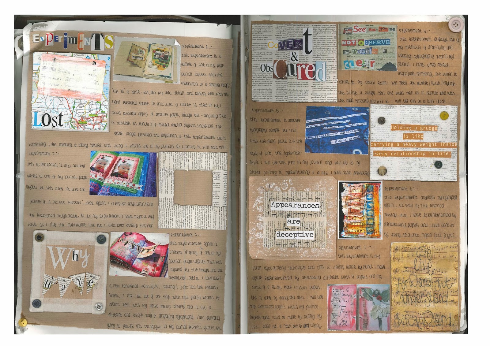
These four images display vector imagery through Adobe Illustrator to which I created these on, I choose one of my original photographs I took whilst on my trip to Manchester to which displays part of the Lowry Outlet and a classic black cab. Using the pen tool I outlined the structure of both the building and taxi and developed this through the addition of colour, printing onto different papers, layering images onto one another and altering the opacity levels on some.

Manchester Unit- Photograph Edits


These three edits were originally photographs that I took on our college trip to Manchester which displays Media City and Afflecks Palace to which are iconic to the city. I have edited this photographs using Photoshop through the image adjustment of brightness and contrast, hue/ saturation and using the magic wand tool to detect certain parts, layering them on the image itself and changing opacity levels. I feel overall these have produced a creative appearance to identity itself with Manchester city to relate to its urban, busy and cultural life style.

Manchester Unit- Book Pages


For Manchester Unit, here displays six compositions that were then later used to create a hard back concertina book to represent the North West area. With the addition of typography and imagery that is presented within each of the separate pages as well as the hand rendered and digital features that demonstrate themselves with in all represent Manchester suitably and clearly in one way or another.

Obscure and Covert Unit- Journal Experiment Pages

Here displays two pages from my sketchbook to which showcases six different experiments that I underwent to test and trial with for my final journals.Each of the experiments are placed against research that I found inspiring and suitable to my type of work. Many methods, materials, processes were pursed to reach the final conclusions for my exam journals that I was later to create.

Obscure and Covert Unit- Journal Pages


Here displays just three pages within one of my journals that I produced  for my exam, within these pages are display typography of proverbs, quotes and sayings that provide suitable covert and obscure messages and connotations. The imagery being photographs I have taken of obsolete woodland areas and old fashioned photography in a style of postcard to which provide similar meanings of the exam unit. Within the books I used a range of materials such as fabrics, ribbons, buttons and different types of textured papers. 

Obscure and Covert Unit- Journals


Here displays four photographs that I have taken of the two books I created and developed for Obscure and Covert exam unit. I choose to create two journals as I believe the connotations of obscure and covert fit will with the aspect of journals as these hold peoples private secrets and stories. I choose to create these hand rendered to display versatility and let my love of crafts flourish. 

Design Museum Experiment Logo Designs


In order to create new branding for a pop-up exhibition for the Design Museum, I first chose the title ‘Vision’ as this provides positive, inspirational connotations. I then underwent the development and experimentation of my logo design using both Adobe Illustrator and Photoshop and these illustrations displays my experiments as I have tested to print onto different papers including graph paper, sugar paper, and isometric paper.

Design Museum Merchandise


Here displays four sets of merchandise I have designed that are used to promote and advertise the exhibition. Firstly I have created three badge designs that will act as freebies to act as 'moving advertisement' as these will be worn and shown to the public. Secondly I created two design pages for an app including the home page and an information page, by clicking on the home page logo this will locate you to the different areas of the Design Museum that are represented and shown through of the displayed logos. Finally I have created t-shirts and bag designs that both use typography and imagery through the designs keeping consistency as these relate to my logos as these are presented on them.


Design Museum Billboard Refinment


As an advertisement for the Design Museum Pop-up Exhibition tour, I have developed a bus stop billboard which features the logo as the centre focus, using direct address to communicate. Interaction with the public has been added through the use of the billboard being on a non-stop loop as it will move on a cycle as it will first display my logo of the six circle to represent the Design Museum and then each of the logos will appear solely being centred positioned to attract potential visitors to attend the exhibition. 


Design Museum Final Logo Design


Here displays my final logo design, and the six separate circle logo designs that are used within. I have choose to represent the Design Museum through the logo brand identity mark as within the Design Museum there are six different areas to which are: Taste, Why We Collect?, Materials & Processes, Fashion, Identity & Design and Icons and to which with the use of typography and imagery these have been translated to relate to the areas that are suitable, for example 'Fashion' has been represented through the vector image of the scissors and the letter 'F' been placed beneath. As well with the colour scheme being solely black and white this creates a simplicity, contemporary graphic for logo designs. 

Design Museum Competition Design Sheets


Here displays 3 design sheets, ‘Visual Research’, ‘Initial Ideas & Design Development’ and  ‘Final Concept’ to which I have produced to show case my development stages up until the finalising of my work, ranging from artist inspiration to logo designs and merchandise. Through the creation of these design sheets this has allowed me to display all the ranges of work I went through to reach the final stage.